

LA Tourism & Convention Board
OVERVIEW:Through a first-time partnership between SNO and notable design studio and font foundry, House Industries, a new vibrant logo, iconography, and brand identity was developed for the Los Angeles Tourism and Convention Board.
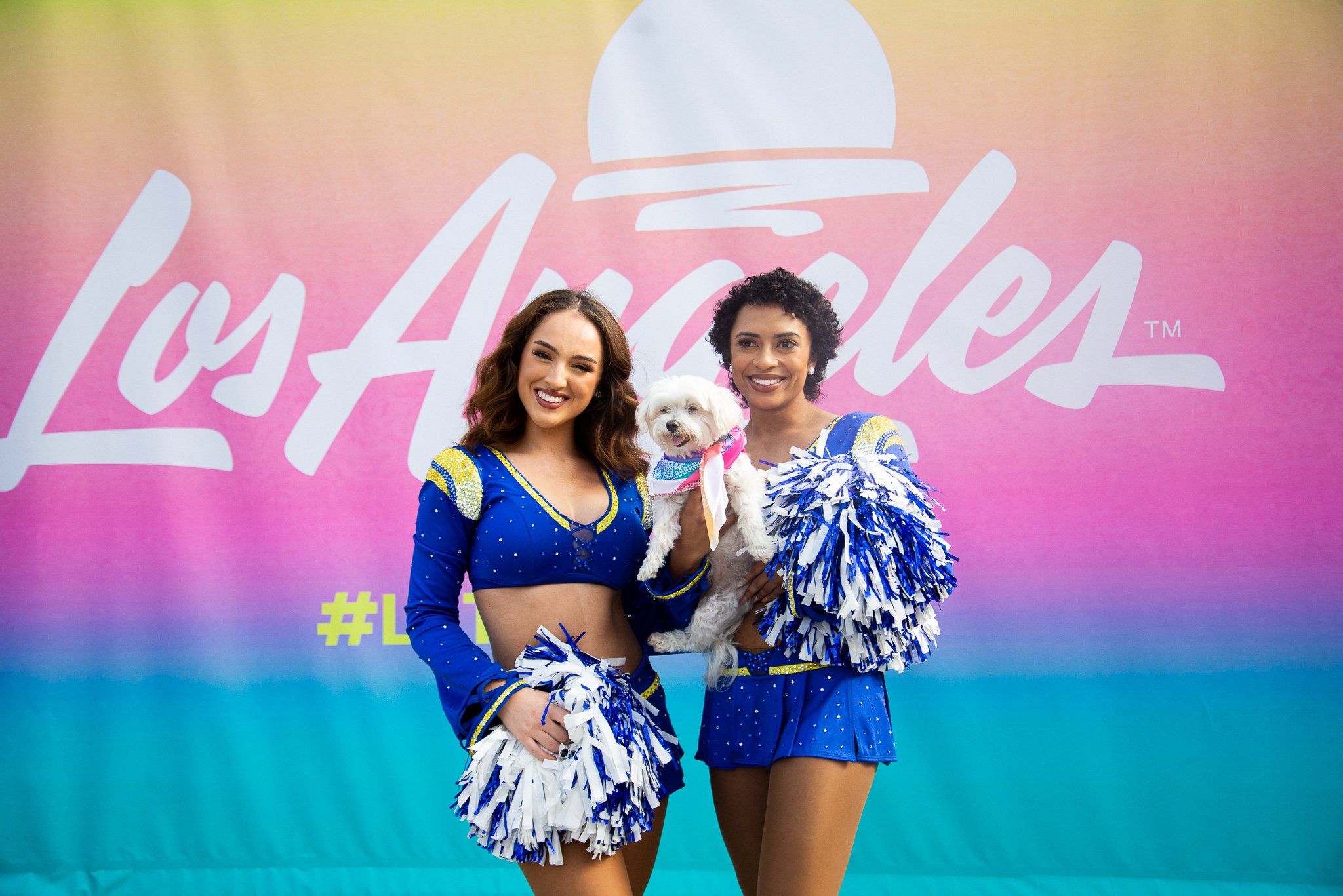
The original Los Angeles logo was nondescript and did not properly embody the spirit and diversity of the city. SNO collaborated with House Industries to create a new logo that is dynamic, vivid, and embraces the optimistic spirit of Angelenos. The script type is bold, timeless, and welcoming as it evokes an LA feeling of movement and self-expression.
CLIENT:LA Tourism & Convention Board
COLLABORATORS:House Industries
SERVICES:Logo, Brand Identity
The sun motif is a highly recognizable symbol that reinforces the equity that Los Angeles owns in breathtaking sunsets. The dome shape of the sun mimics L.A.’s iconic architecture such as the Hollywood Bowl, the Cinerama Dome, the Griffith Observatory, and the orchestra pit at Walt Disney Concert Hall. The artistic brush stroke under the sun abstractly represents the ocean, creativity and self-expression to underscore that everyone is welcome here. Vibrant gradient colors ranging from sunburst yellow to ocean-inspired teal work in harmony, serving as both a visual representation of LA’s diversity and the journey of LA’s sunrise to sunset.
“When you say ‘Los Angeles’ it doesn’t necessarily mean just a city. It’s a whole mindset, a vibe, a culture, and as an Angeleno, it was exciting to me to take on the creative challenge of designing a mark representing all the things that Los Angeles means to people.


On that creative path, I worked with my team at Studio Number One and the inspiring cool factory that is House Industries, led by my friend Andy Cruz. We all dug deep into LA culture and came up with a great answer that we feel embraces the spirit and optimism of LA.”
- Shepard Fairey, Creative Director of Studio Number One
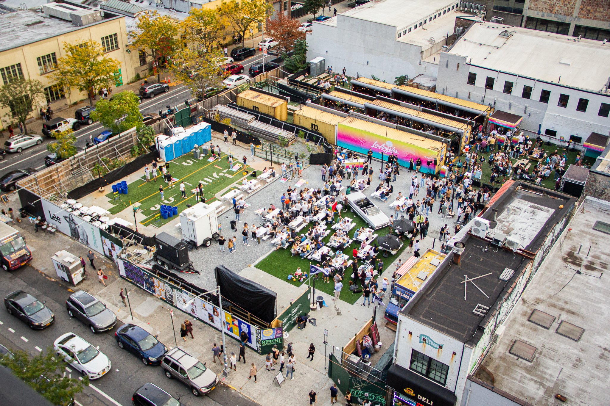
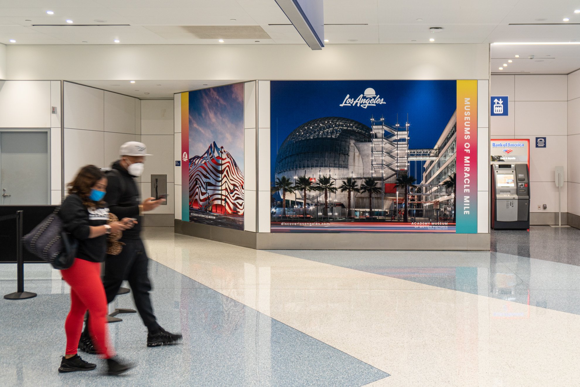
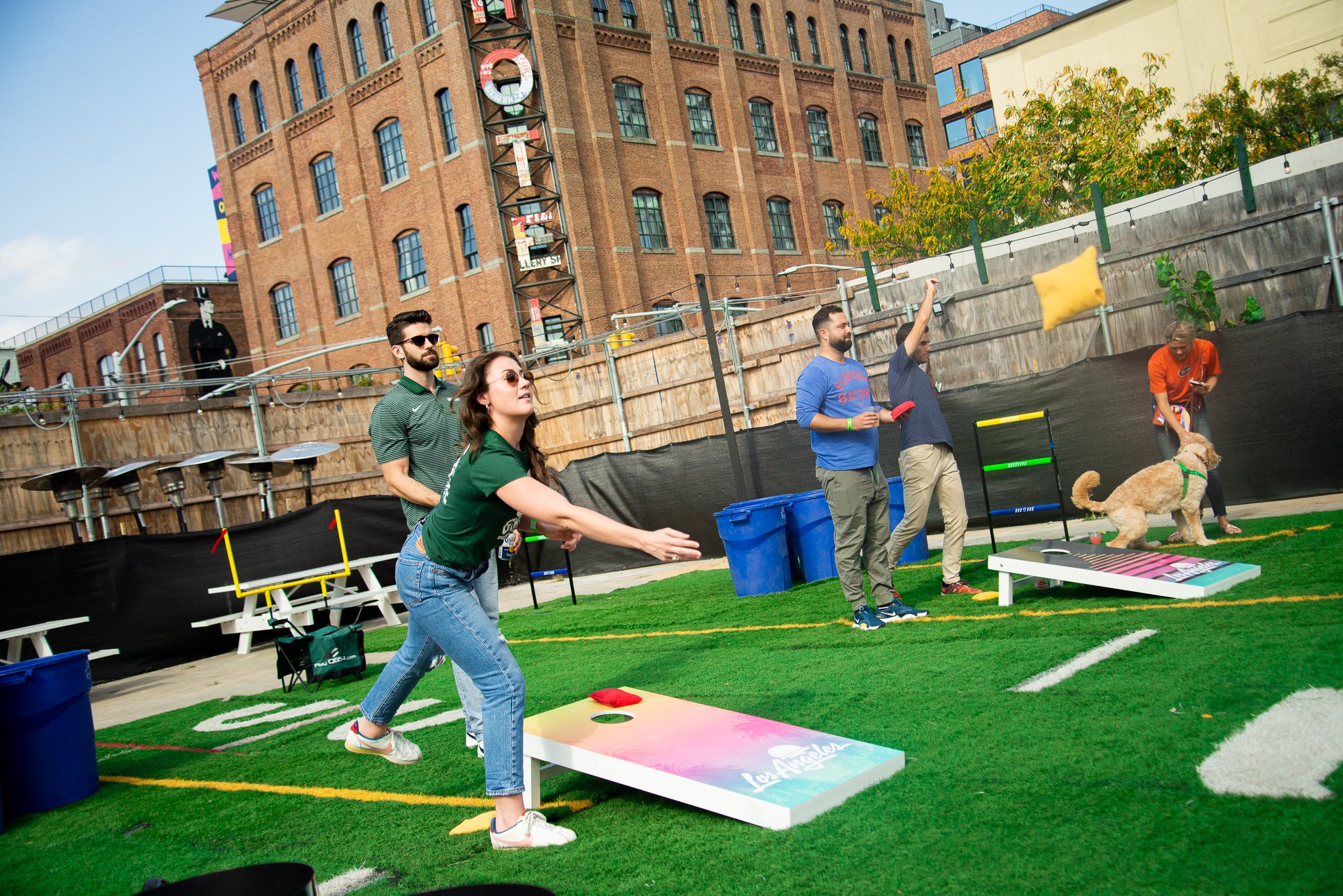
SNO created comprehensive brand guidelines to formally outline the look and feel of the Tourism & Convention Board’s brand messaging as well as provide a brand toolkit to enable staff and third party vendors to easily utilize the branding and to ensure cohesive and consistent messaging throughout its various programs and campaigns. Logos and brand architecture for programs under the LA Tourism umbrella such as Dine LA, Shop LA, Arts LA, and Play LA were also developed.
“The history of iconic signage and inspired typography created in L.A. is as diverse and unique as its people. The chance to Wonder-Twin House Industries & Studio Number One is something Shepard Fairey and I have been waiting years to activate — and it happened in the form of the new Los Angeles logo. Distilling that potion of influence into a mark that honors the past but feels new is something all the artists at House and SNO took personally.”
-Andy Cruz, Founder of House Industries
News & Media:
https://www.fastcompany.com/90652166/los-angeles-has-a-vibrant-new-logo-inspired-by-everything-from-sunsets-to-car-culture